miércoles, 18 de diciembre de 2013

The feels of the religious people


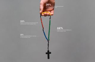
Firstly, talking about the information graphic, we can say that is very figurative because the principle element is a real image which express the principal issue which the information graphic is talking about.
We can say that this information graphics are more decorative because the realistic principal element have to pay attention of the spectators, but also are very funcional because the realistic element explain us what is about the information graphic and also the percentages are represented in the same realistic element with a diferent colors and with a realistic elements which are of the principal element.
The three information graphics are lightness because there’s only one element in the center of the graphic and the percentages with their information data hold a little space. There’s a big background in all information graphics that also produce that the spectators par attention to the most important information.
Each of information graphic is unidimensional in the sense that is talking about one religion and, of this religion, It informs about differnt aspects of the people who are of this religion. But If we refer to the information graphic not as whole If not as individuality, only one of these information graphic, we can say that is multidimensional because in a one graphic there’re different data of how the religious people feel.
All information graphics are very original. For exemple, the use of the musulman woman photography in order to inform the audience that this information graphic is about the musulman religion. Also we can see another issue of the originality which is the use of the realistic elements in order to know the size of each percentage. This originality have to be the information graphic more attractive.
The three information graphics, as a whole, are a little redundancy because in all are explained the feels of the religious people, but are more novelty because the information data is always diferent in all religions and also, each of them, inform about a diferent religion.

UE employment


My design graphic’s work is about the employment and unemployment of the European Union.

On the first place, there’s a chronological sequence which, on one hand, there’s the number of employment and the unemployment of four years, where you can see the change, and on the other hand, you can see the percentage of men and women who worked in these years.
On the second place, there are two maps in which there’re the countries in which there are more employment and, other, with the unemployment. Also, in each of them there’re the two countries which have the smallest number and the tallest number of enployment or unemployment. In order to do more understandable I put two legends near the maps which inform of the data that appears on the maps.

The pictograms of the information graphic are two man who represents one, the employment, and the other, the unemployment. I think that this pictograms are very simple to understand and in all information graphic appear in order to mantain the spectator informed in all the information that he can see. The background’s colour is very neutral and doesn’t have to pay the attention in that, is an important thing. All the other shapes are in a different colors but of the same line of the background.
I think that is very funcional and creative because is simple and very visually comprehensive.

Effects of sleep in the production


http://khurrambajwa.com/indexhibit/index.php?/posters/information-graphics/

I put this information graphic because I think that is a good idea to explain what are the effects of don't sleep and how it afects in the different things  which one have. 

Firstly, I'm going to talk about the abstraction of this information graphic because is abstract but with the abstraction can inform very well. All the lines in different colors are very simple but expose the information required. Also is very functional and not decorative because all the lines and pictograms are only to inform, but it's true that the form of the line and the different elements that have this graphic are also decorative. This information graphic isn't lightness and isn't dense because there are some information but also there are much information. We can talk as a more lightness information graphic than dense because the information are put in a clear way and with much empty spaces. Also, is a multidimensional graphic because in the graphic there are two different points where the rest of information depends on these (week 1 and week 2). For this reason you can see the effects of don't sleep, because there's a comparison between two weeks with different hours of sleep. Is an original information graphic because they way of express the effects and consequences of the sleeping time, putting the number of hours of each thing, the lines more or less tall, and the elements get to clarify the information. I think that this data is very difficult to explain in an information graphic and, in this case, is a very good way and clarify. Finally, the graphic is novelty because there are different elements which represents many aspects of the people live and this give a variety of visions that the people can have.

In general, this information graphic is very functional and informative because it can explain very well the information that the author tries. 


martes, 17 de diciembre de 2013

My CV


My CV that I exposed in this entry is an information graphic in which I exposed my education, my dance career, my internships and jobs, my skills, and my basic information as mobile phone number, where I live, etc.

On the first place I exposed my education as a chronological line with the periods of my education. In each period there are a girls silhouettes who represents the age that I have in each period. Also there are the logos of each period indicating the school which I studied.

On the second place, I exposed my dance career where you can see all the exams that I had and the logo of the academy which the exams are.

On the third place, I exposed my internships and jobs where you can see the enterprise's logos which I worked.

On the fourth place, I exposed my skills which are represented with different element's silhouettes that represent each of the skills. For example there's a camera that indicates the photography knowledge. All these skills are in different height indicating the different levels of knowledge.

Also I put an own image under which there's my basic information: birth date, where I live, mobile phone number, my email, and the social networks which I belong to.

All information is represented in chronological sequence in order to know when I have all the aspects. and the skills graphic is presented in a line with all the skills indicating the level of each skill.
The colors are very simple and I think that with a black background and all the rest pink and white is a creative way to attract spectators. The reason of used pink color is because I like very much this color and, thus, It represents me.


Go of Cocktails


Today I would expose this information graphic that I found on the internet.

The information of this graphic is very abstract because the circles that represent the quantity of the product are simple but you must read after to see this circles.
Is very functional because yo can see in a very concrete way the quantity of the products that each cocktail have. But also is very decorative because the drink is realistic and have to pay the attention of the spectator. The information graphic, in the whole, is more lightness because there are a lot of empty spaces, and the light that comes of the background have a realistic environment. Is an unidimensional information graphic because only there's a one kind of information, only presents the products of each cocktail. In general is very original because the type of light and the way to present the information (the products and the quantity of each cocktail).

In general is an information graphic very attractive because is original and very creative, and these aspects provoke an attention of the spectator.


lunes, 16 de diciembre de 2013

Art Robberies


In this information graphic I would like to expose a chronological facts of the Isabella Stewart Gardner Museum robbery and also, an exposition of the most 5 stolen artists and the robberies in the last five years, organized since the tallest number of dollars cheated to the smallest.

On the first place, I put an exposition of the facts that occurred on the Isabella Stewart Gardner Museum. In order to expose this robbery I divided the facts in three sections decorated with the silhouettes of two polices and two security guards. These figures are not only to decorate If not to do the chronological sequence more attractive and to indicate to what refers each section. In order to do more comprehensive that this part is a chronological sequence of the events I put thief's silhouettes in a line and to remark each section the thief that belong to the section is bigger than the others that are in the line. On the last thief which refers to the last section of the sequence of the events there are three arrows which mark the three cheated pictures indicating the picture's name and the number of the rest of cheated pictures of each artist. The fact that there's a line of thieves have to the spectator follow the events and the police and security guards silhouettes have to get attraction of the spectators.

On the second place, I put an information graphic of the most 5 stolen artists in which appear a picture of each artist since the biggest size to the smallest size that indicates the biggest number of stolen pieces. For example, the biggest number of stolen pieces is of Pablo Picasso, for this his picture is putted bigger than the others. Also, under each picture there're the name of each artist and the number of the stolen pieces, each part in a different color in order to know that there're two kinds of information.

On the third place, I put another information graphic of the robberies in the last five years indicating the month and the year; the place and the stolen prize of each robbery. To be more attractive I put the image of each museum in a frame, as It was a picture. Each data are in a different color to separate the kind of information, and the number of stolen prize is bigger than other information because is the most important information.

I expose the information written in a different colors, mixed blue, black and violet in order to distinguished the kind of information that there are in the information graphic. For instance, the light blue is for separate the sections of the whole information graphic or black color is for the most basic data. I organized in a vertical way because I would like to give more importance to the Isabella Stewart Gardner Museum robbery, for this is the tallest information graphic. As you know, the people read since up to down.

miércoles, 11 de diciembre de 2013

Aircrafts Information Graphic


In this exercise I would like to give more importance to the ten accidents with the biggest number of fatalities. To make this I did a very simple map with certain shadow effect and with ten squares which represent each of the countries that had the hardest accidents. Each square is blue but the most dark represents the hardest accident and the most light is the soft accident inside the ten hardest accidents.

Also I would like to expose the percentages of each of the continents of the world. These percentages represents the number of accidents of each continent and these are presented since the continent which have the biggest number of accidents, to the continent which have the smallest number of accidents. In this graphic I put an airplane shape in the background in order to establish a clear difference that other graphics and in order to put an esthetic point in that graphic.

In these two graphics that I exposed in the same information graphic I put blue that is the predominant color because it have reference to the sky where the airplanes fly on.

Also, I have other graphic that is a realistic map in which I've presented the six accidents without fatalities. I put this map more realistic than the other because the information that is represented in this is better, is not tragic as the other graphic.

In order to distinguish the number of people aboard, of fatalities and what is the operator of each accident I put a legend in which appears each colored square with what represent each of them.

Finally, I would like to explain us that this information graphic, in general, is more simple because have the information in a particular ways of representation and this information is very abstract, thus the information graphic is not complex. Also this information graphic is lighter because the background color is soft and the other colors aren't very hard, and also It is more familiar because the ways to represent the information is not very complicated.